Nov 11, 2024
Branding
Pop's Car Wash
MISSION
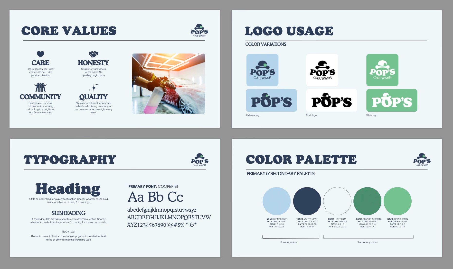
Pop's Car Wash needed a brand identity that honored the founder's legacy while positioning the business competitively in northern New Jersey's car wash market. The goal was to create a warm, approachable visual system that served the entire community, from young families to longtime locals, without reading too juvenile or corporate. The challenge was balancing sentimental elements (Pop's bowler hat, Irish heritage, Navy service) with strategic positioning that highlighted the business's key differentiator: quality hand-drying service at fair prices. The deliverable was a complete brand system, going from strategic positioning to logo variations, typography, color palette, brand voice, usage guidelines, and a logo animation for digital applications, that the owner could confidently deploy across all touchpoints.
ROLE
Creative Direction, Brand Identity, Web Design & Development
URL
Coming Soon
APPROACH
I started with strategic groundwork: competitive analysis, audience personas, and positioning. The goal was to anchor design decisions in business goals and brand identity, not just personal taste. This foundation enabled me to guide the client away from initial preferences (pastels, Bronco in logo, bubble treatments) that conflicted with her stated goal of serving the whole community. I presented two strategic directions through mood boards, letting the visual work demonstrate trade-offs, then refined her chosen direction to balance playfulness with professionalism (solid navy grounding, clean typography, strategic color application). Throughout the process, I protected brand integrity by redirecting personal elements to appropriate secondary applications while honoring meaningful requests like the green four-leaf clover. The result was a complete, scalable brand system with clear usage guidelines that positioned Pop's as approachable yet quality-focused—exactly what the business needed to compete against corporate chains while maintaining authentic neighborhood warmth.

RESULT
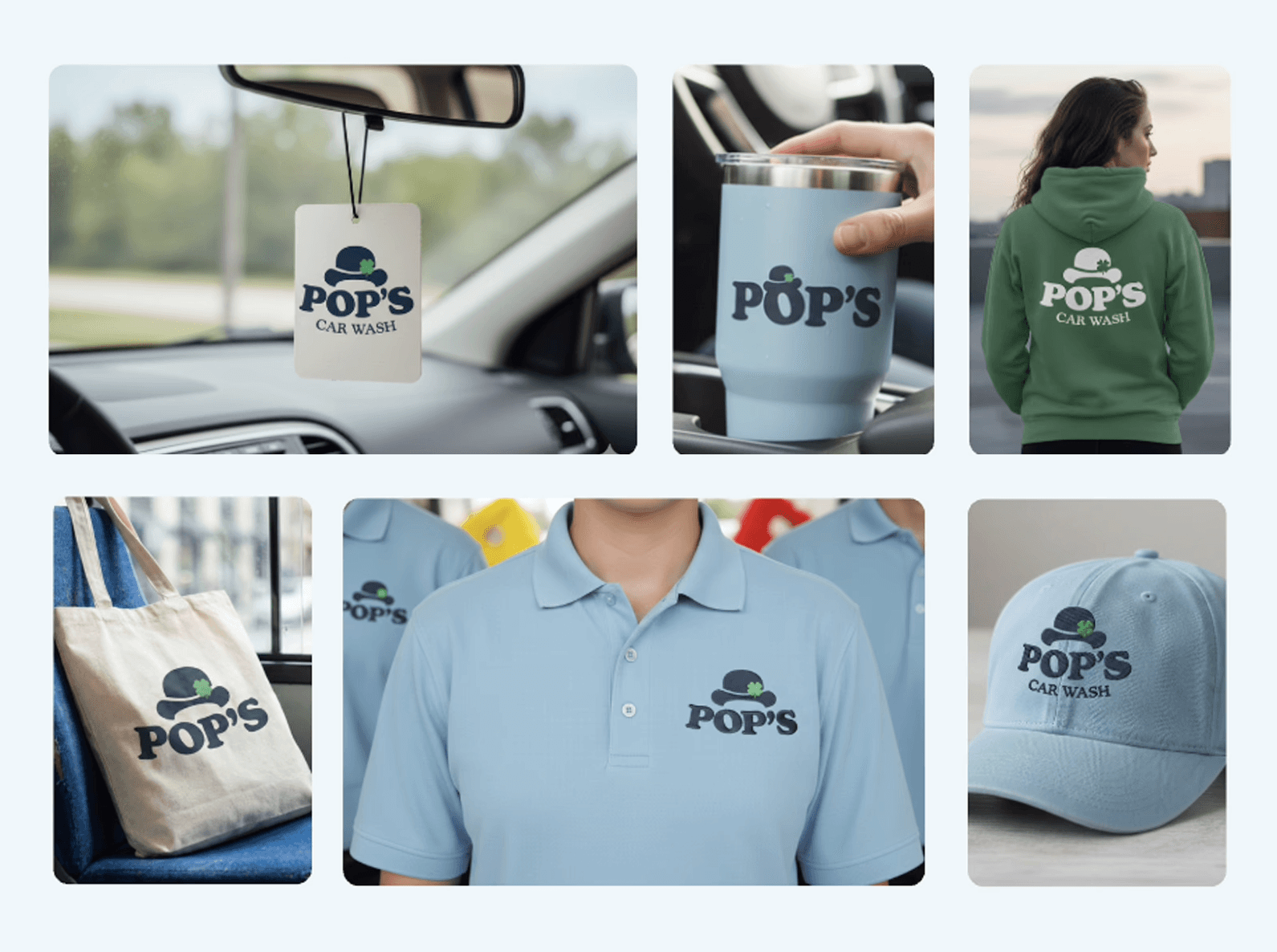
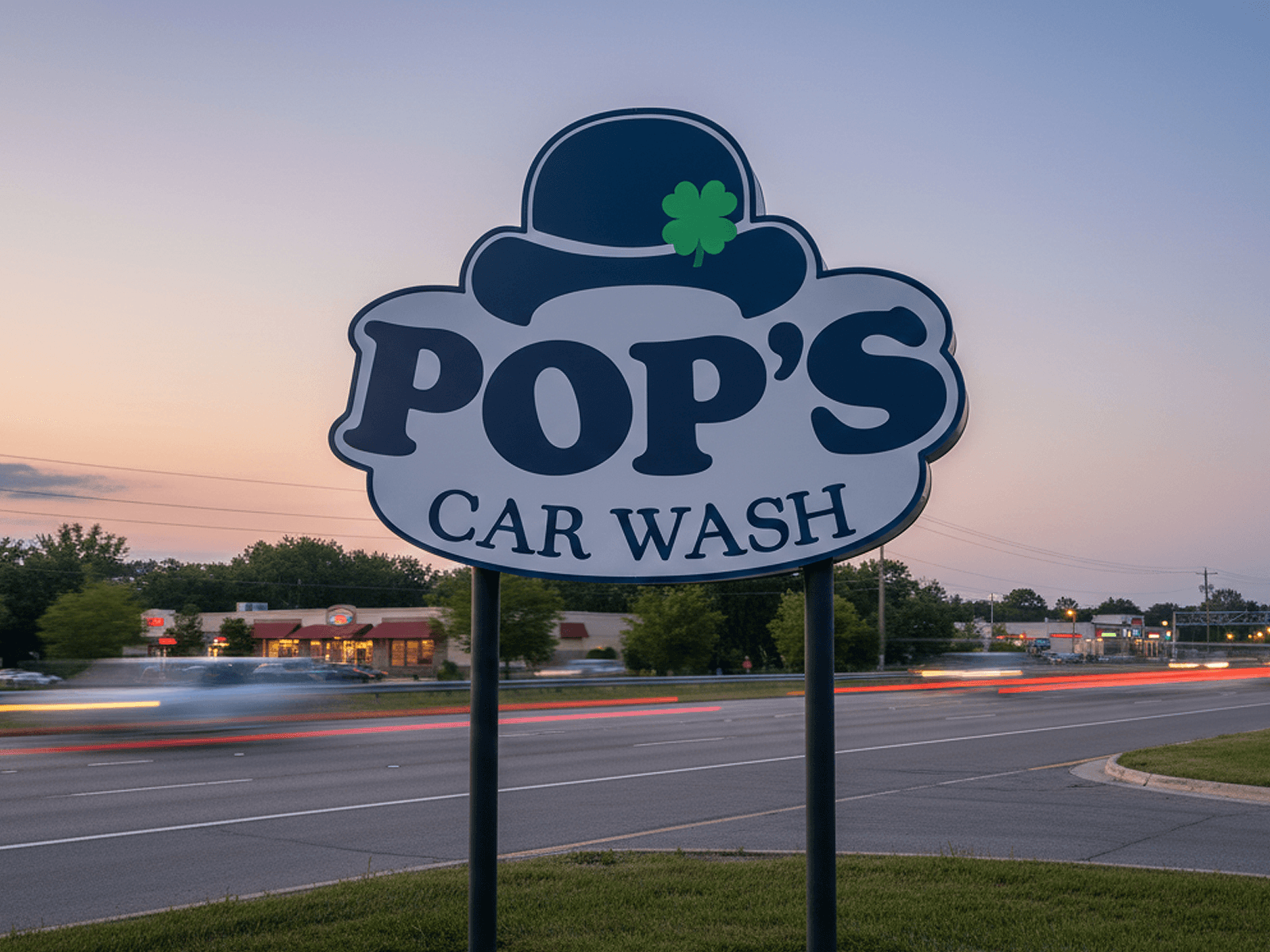
The complete brand system (logo variations, color palette, typography, brand voice, and usage guidelines) was delivered in professional brand guidelines with application mockups. The client's response exceeded expectations: she was genuinely emotional that the design honored Pop's legacy while giving her a brand she felt confident presenting professionally. She's actively implementing the identity across business cards, uniforms, signage, and merchandise, with the navy-and-green system successfully differentiating Pop's from corporate competitors while maintaining neighborhood warmth. The brand is performing exactly as intended: memorable, scalable, and authentic. I'm currently designing the accompanying website to extend the brand system digitally, ensuring consistency as the business establishes its market presence.